Labor Management App
Timeline
April 2019 - Sept 2019
My Role
- Senior UX/UI Designer
Team Members
- David Pando - Senior UX Designer
- Art Osetrov - Senior UI designer
Tools

Summary
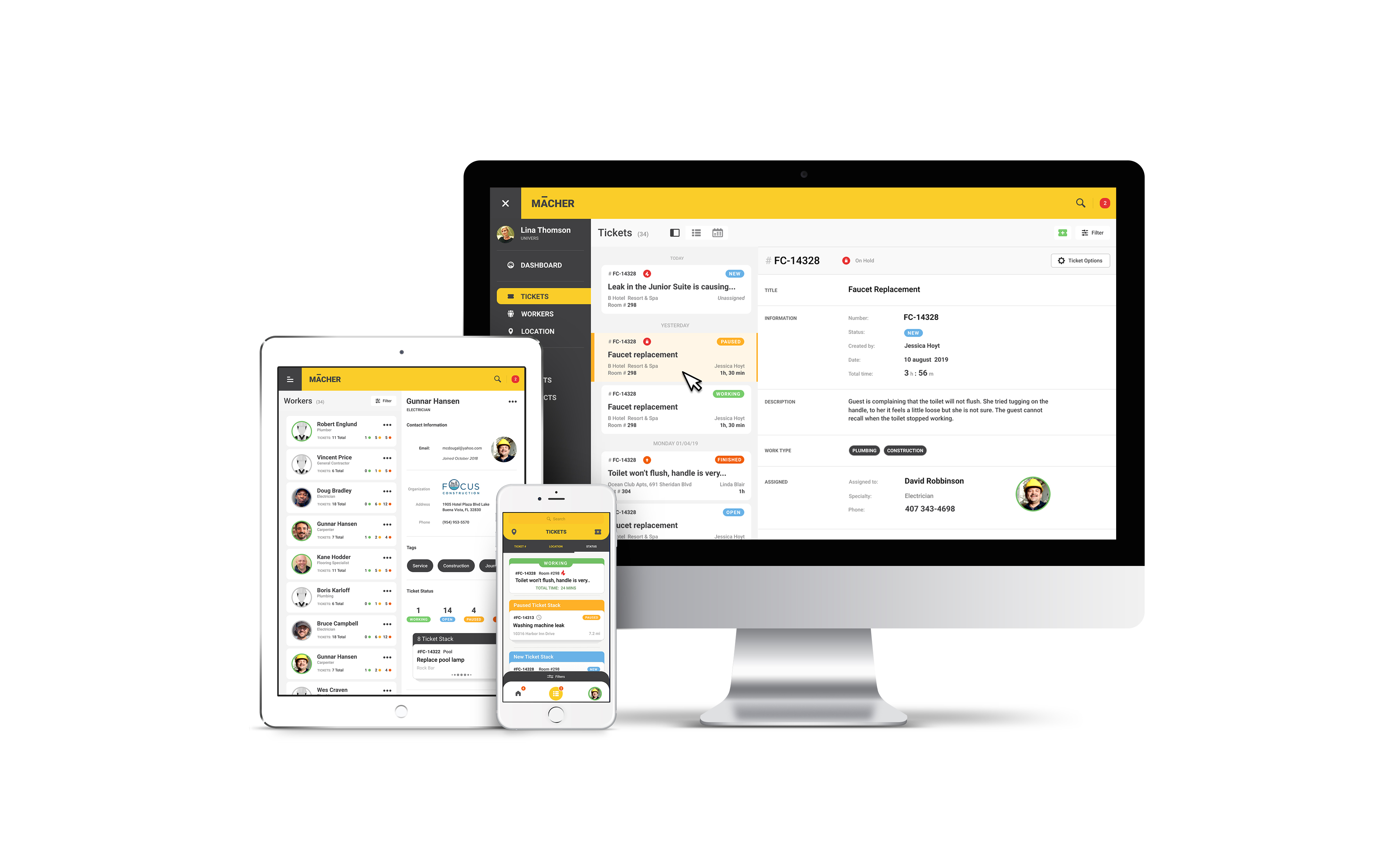
Labor Management in the hotel industry has become a very big issue nowadays because responses need to be faster and more accurate than always to keep the customer satisfaction. On the other side the UX in the tools that the industry is using now are very old and lacking of dee understanding of the user. The idea of Macher App is to combine the main functionality of all of this tools in one unique system that tracks tickets and people.
Problems
One of the problems is that the system do not properly work together, so accounting and labor management can be very confusing, is very expensive to maintain all of this softwares individually and probably the main issue is when one of the platforms decide that they are getting out of the market, because the alternative solutions are usually more expensive, require training again and is not guaranteed that it will work with the existing software .
Main Use Cases
Worker Use
Dispatcher Use
Site Hierarchy - Content Navigation
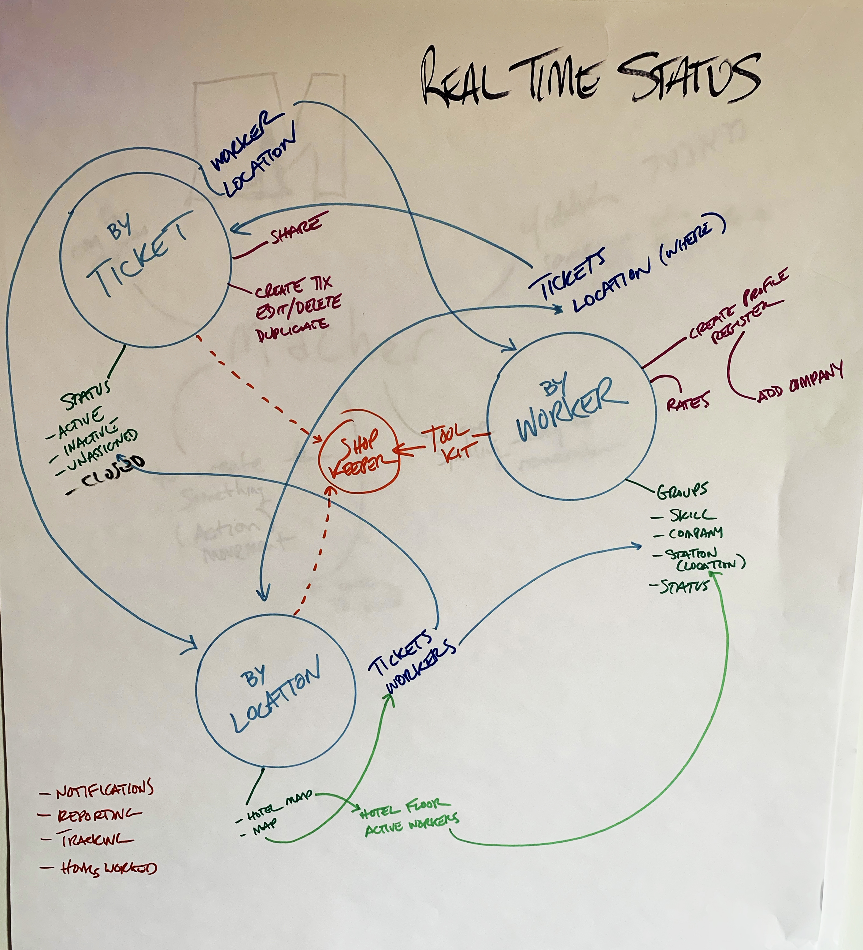
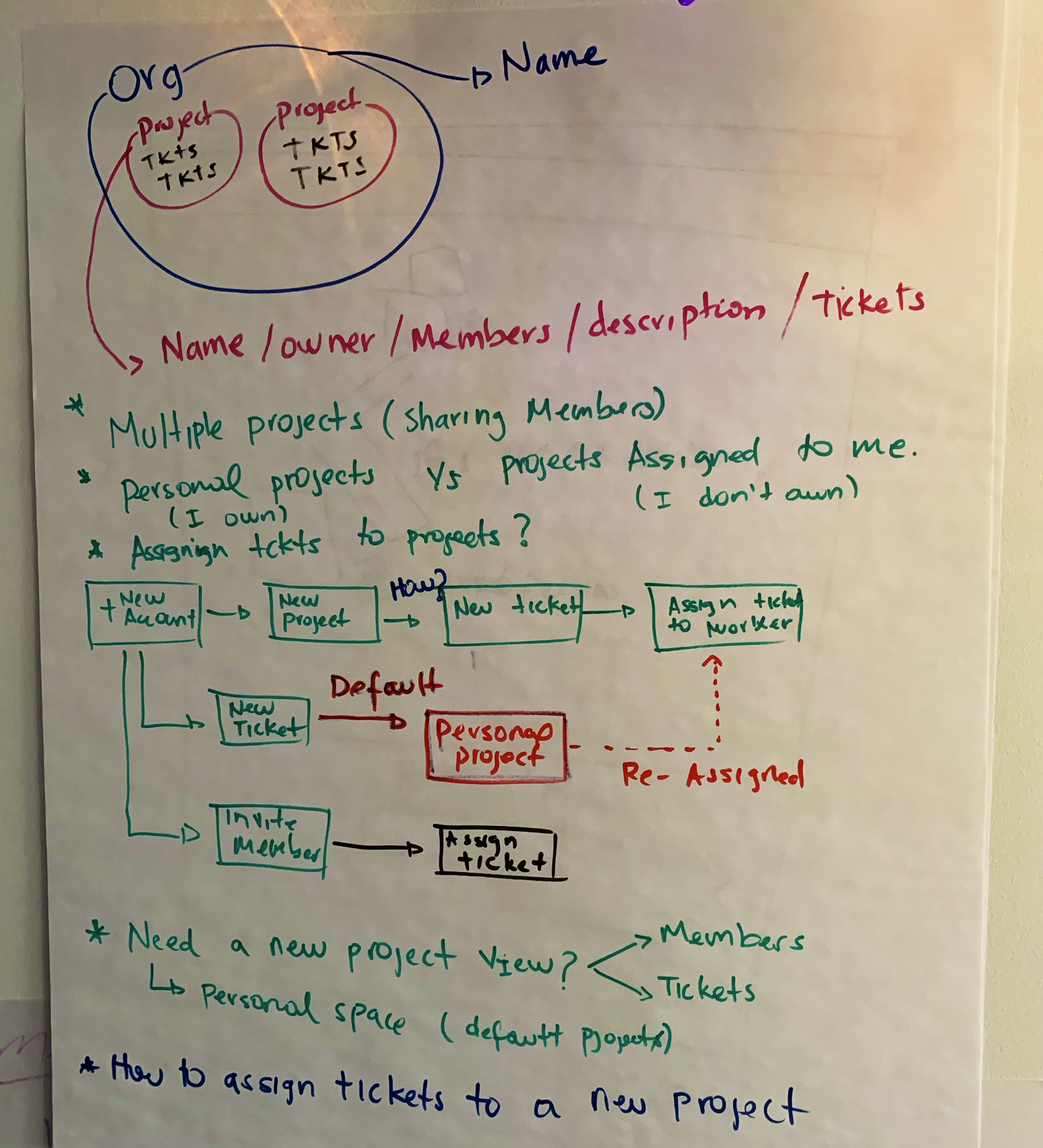
Defining the flow of the content in this project is very important because at the end is the same information but the way you look at it is different and the benefits of how you search it is different as well. We defined 3 main information pools, the workers, the places, and the most important one, the tickets. All of them are correlated but each one has a value at the moment you need to generate a report.
Worker
● A Worker will be the person doing the job, the one with tasks assigned to.
● The Worker App will allow to measure the time of each ticket, review if its blocked, paused, finished.
● A worker will be able to attach documents, photos and add notes to each ticket in case it is needed .
● A worker can not edit a ticket at any point.
● As a Worker you can create tickets and assign them to the dispatcher in case there is another issue that needs to be fixed.
Dispatcher
● A Dispatcher is the person who will create and assign the tickets to the different workers.
● A Dispatcher can see if the workers are available, where are they and if they are working at the moment.
● A Dispatcher can duplicate, archive, stop a ticket in case is needed and can only edit them as long they have not been started .
● A Dispatcher can search information by location, worker or ticket and will have a message option to text the workers direclty.
Wireframes
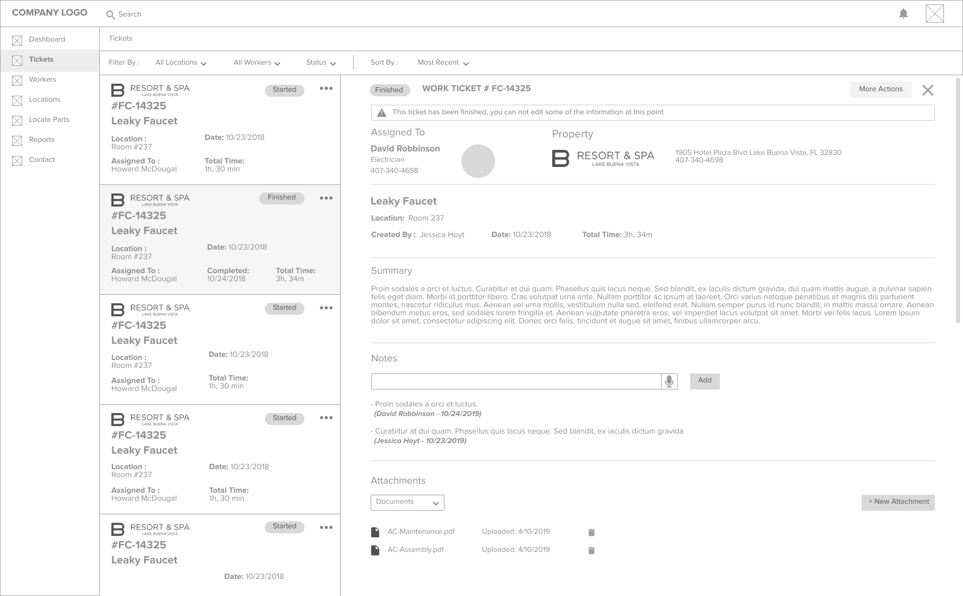
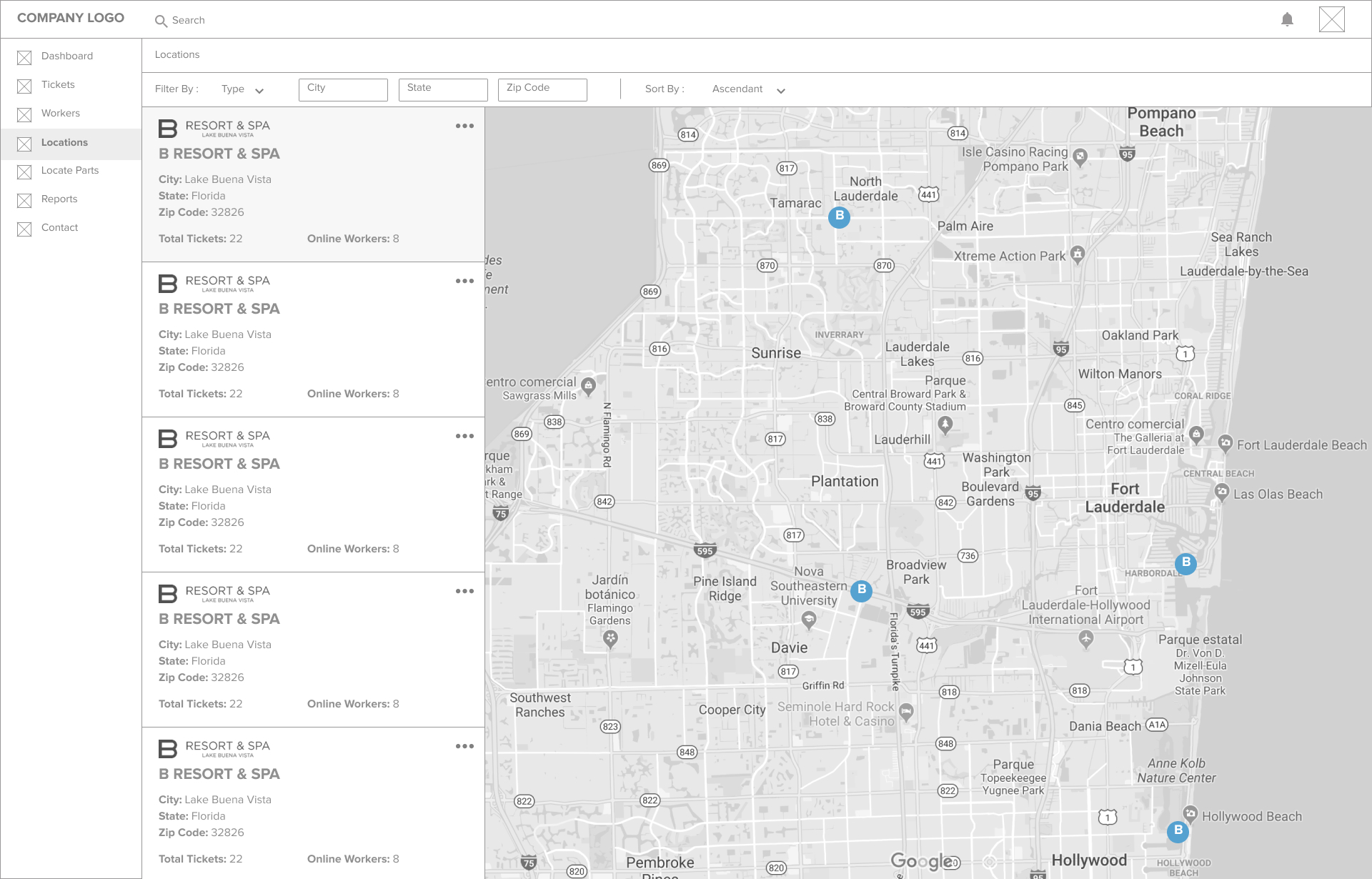
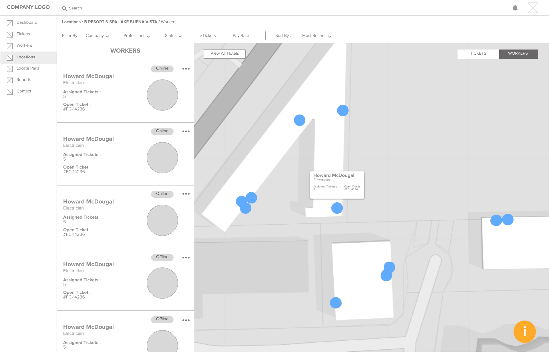
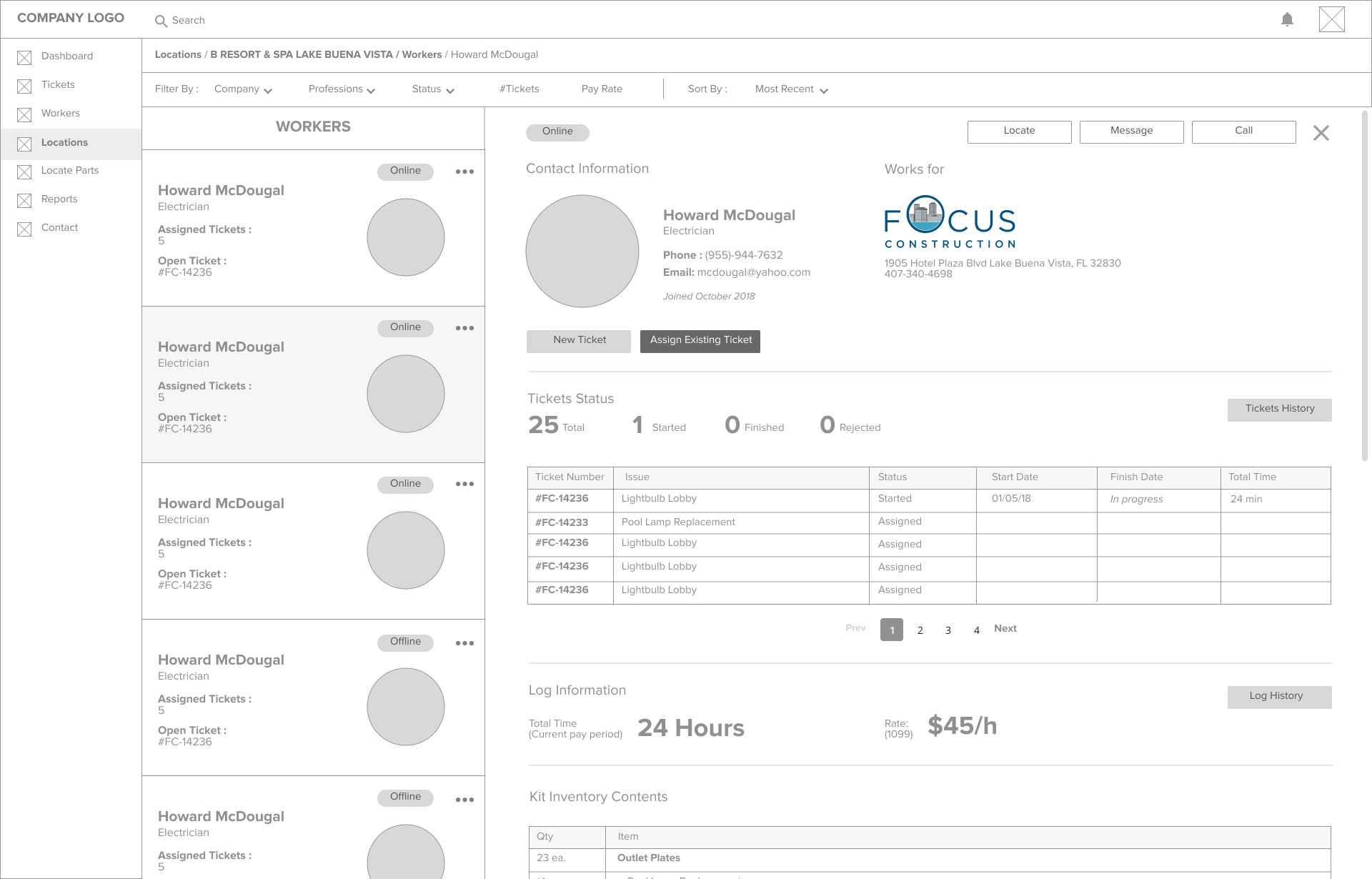
Because Macher App is only an extension of the main platform, we decided to start the ideation and wireframing phase with the whole site including all the differents pools of information. We started making the screens for the main content, Tickets, Workers and Locations, the idea was to keep a very consistent layout across them so we could re utilize resources from the devs perspective.
Version 1 - UI
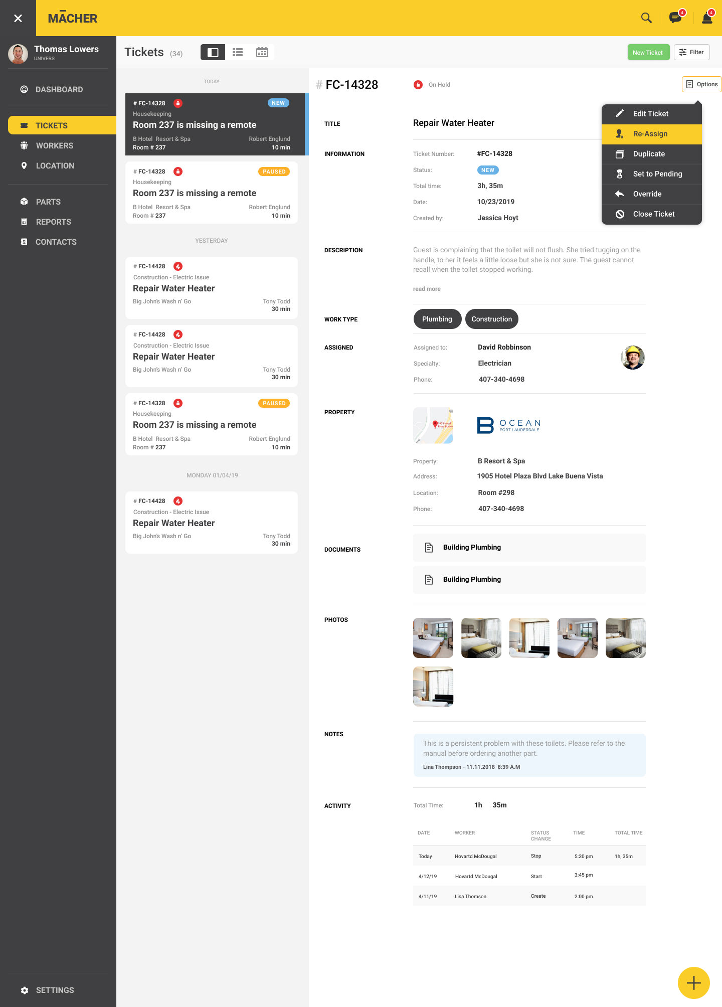
After deciding what the content was going to be and how the user was going to navigate thru it, we created the v1 of the screens adding the corporate colors, following some of the latest UI trends and trying to make it more appealing for the end user.
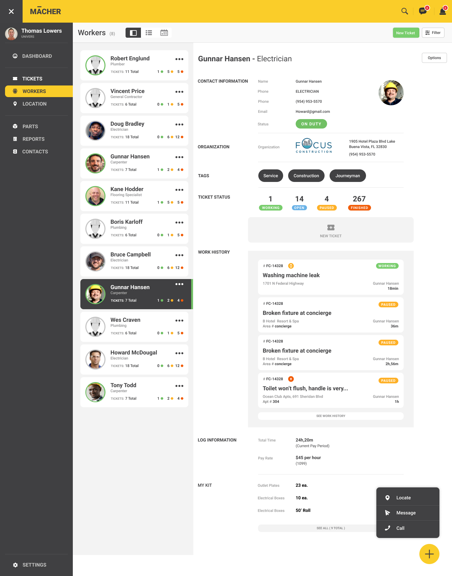
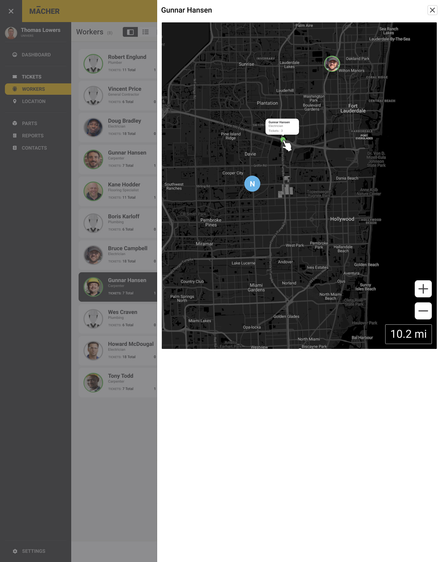
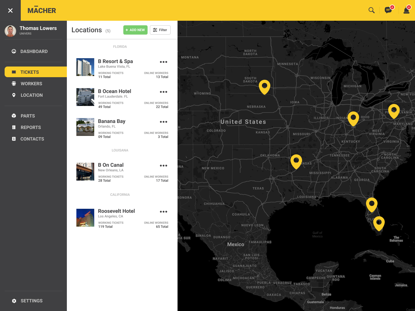
Version 1 - UI Mobile
This platform is 100% responsive, it was designed to be use in mobile and tablet, there will be apps at this point , one is a native app for the worker because we need some geo location information provided by the device, and the dispatcher is a web based app that we designed in 3 main sizes.


Filters Challenge
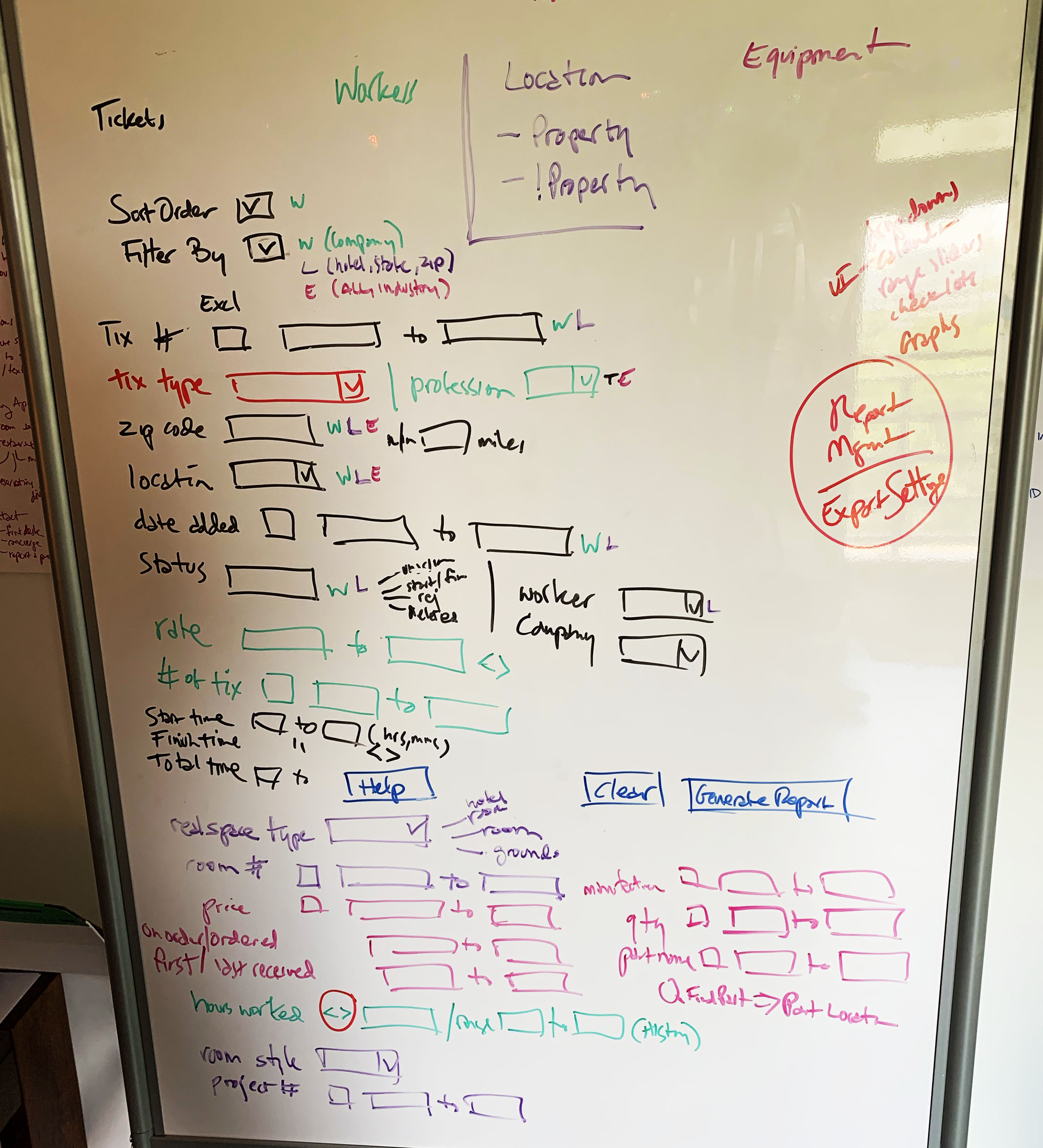
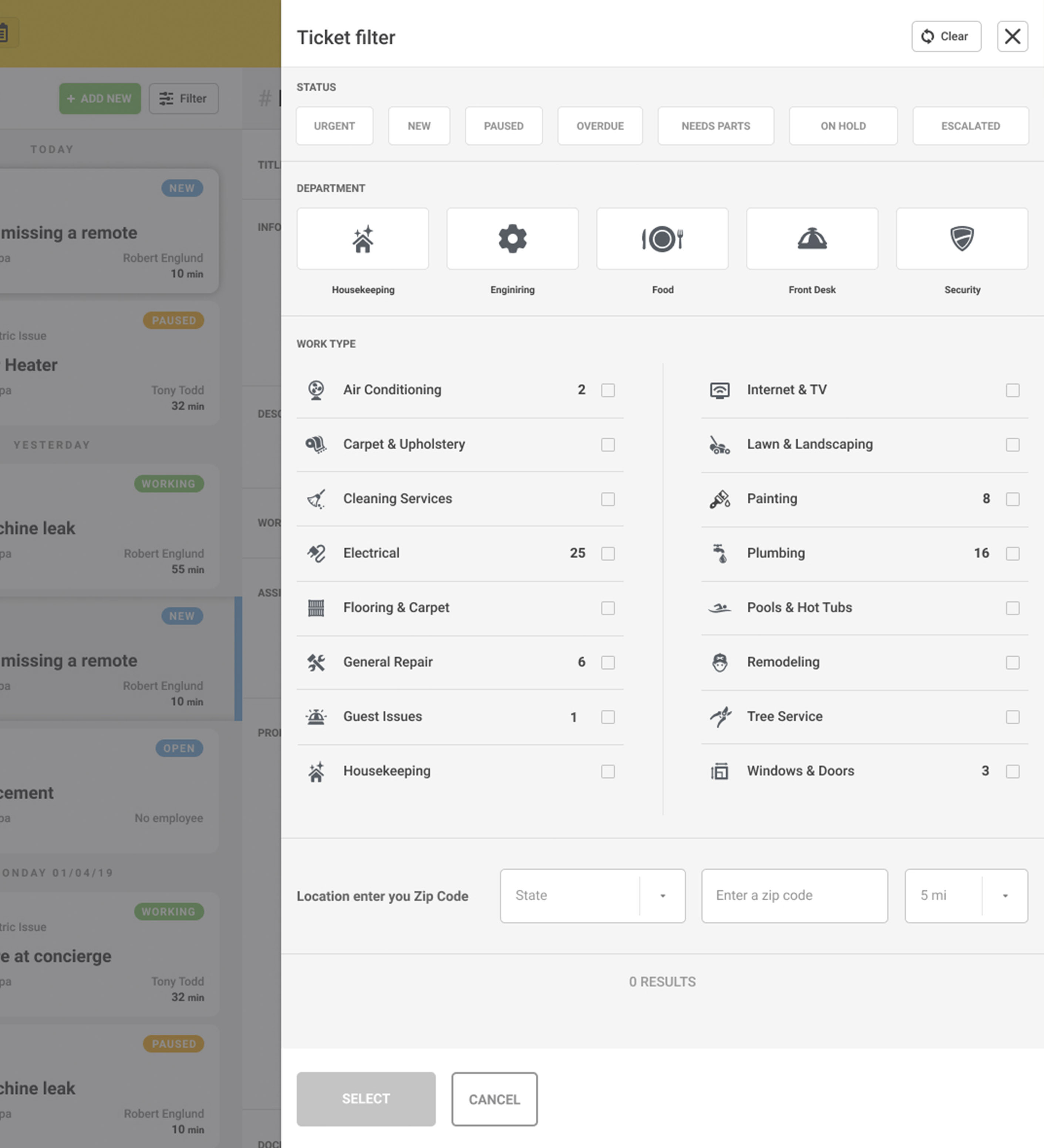
Deciding the way the content flows and the hierarchy of the site was a challenge because the information is all related, the problem with this is that at the moment you need to filter this information it has almost endless possibilities , one of the main challenges at this point in the project was to decide the limits of the filters and what kind of sorting features we would like to have in the mains screens.
We started this challenge identifying what was the information shared between the main data points , this allow us to create the categories of the filters. For this exercise we used color code and letters to visualize the different categories. We ended up with 4 categories, status of the tickets, departments (they will be customizable) , work type and the location of the ticket. All of this happens within the ticket context, for location and workers we pretty much duplicated the pattern but we added specific data point like availability for workers.
People ignore design that ignores people.