Timeline
November 2019 - April 2019
My Role
- Senior Product Designer
Team Members
- Hannah Cunningham -
Product Designer
- Julie Skiver-Stanton -
Senior Design Manager
Tools

Summary
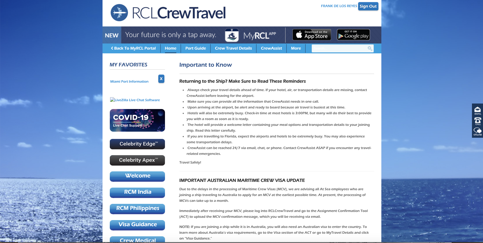
Crew members are vital for the cruise companies, and it is very important to bring them from all over the world in order to start their assignments.Crew App - Processes is in charge of making this possible, generating a electronic contract for the crew members to sign, providing a travel itinerary for each assignment and giving them all the documents needed for the visas that are required.
Context
Royal Caribbean developed an old version for both the app and the website but the systems are very slow and is very expensive to maintain because the way they were built. Most of the databases do not work together and the login info is all over the place, additionally to this the UX was very poor and users complained a lot about the usability.
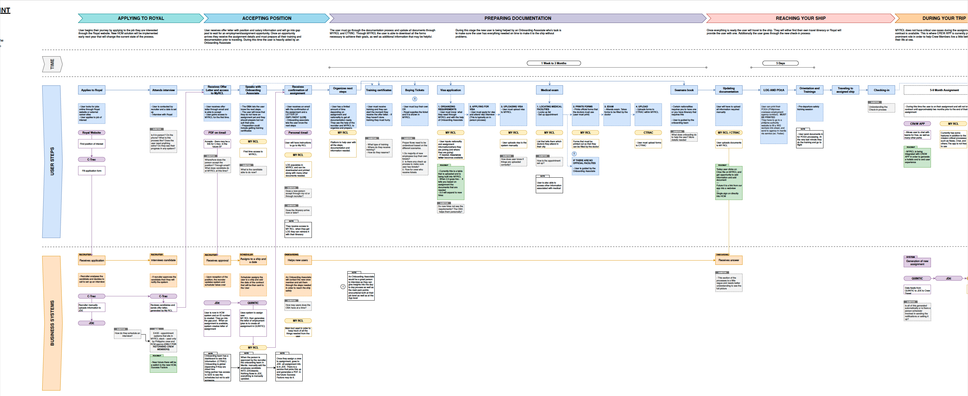
To start designing is vital to recognize what the actual user process is, we took over a research done by a previous team and decided to make it a user flow map to identify the cycle of the product and specifically the features we needed to re design. Most of these processes are done manually using only paper and it is very expensive to maintain. And it is very important to understand that most of the crew members are from outside of the US so the logistics to bring them to the assignment ports are incredibly big
0%
of the crew members live outside of the U.S
Research - Individual User flows
Once we define the whole road map it was important to separate each feature or at least the ones we were going to develop in the near future into small pieces, otherwise thinking the UX of the whole platform would be an impossible task. It is very important to mention that this maps were created in different moments, we did not designed them all at the same time, we were creating them at the same time our development process was moving forward, and the reason for this is because it helped us to gather more information from previous research, and allowed us to be more flexible with elements like navigation and information architecture.
Once we define the whole road map it was important to separate each feature or at least the ones we were going to develop in the near future into small pieces, otherwise thinking the UX of the whole platform would be an impossible task. It is very important to mention that this maps were created in different moments, we did not designed them all at the same time, we were creating them at the same time our development process was moving forward, and the reason for this is because it helped us to gather more information from previous research, and allowed us to be more flexible with elements like navigation and information architecture.
Web Analysis - Old Design
After having the user flow of the entire process. The way we decided to tackle this project was prioritizing what features are more relevant than others in other to provide as much value as possible in the short term.
Priorities
Travel Itinerary
Visa Guidance
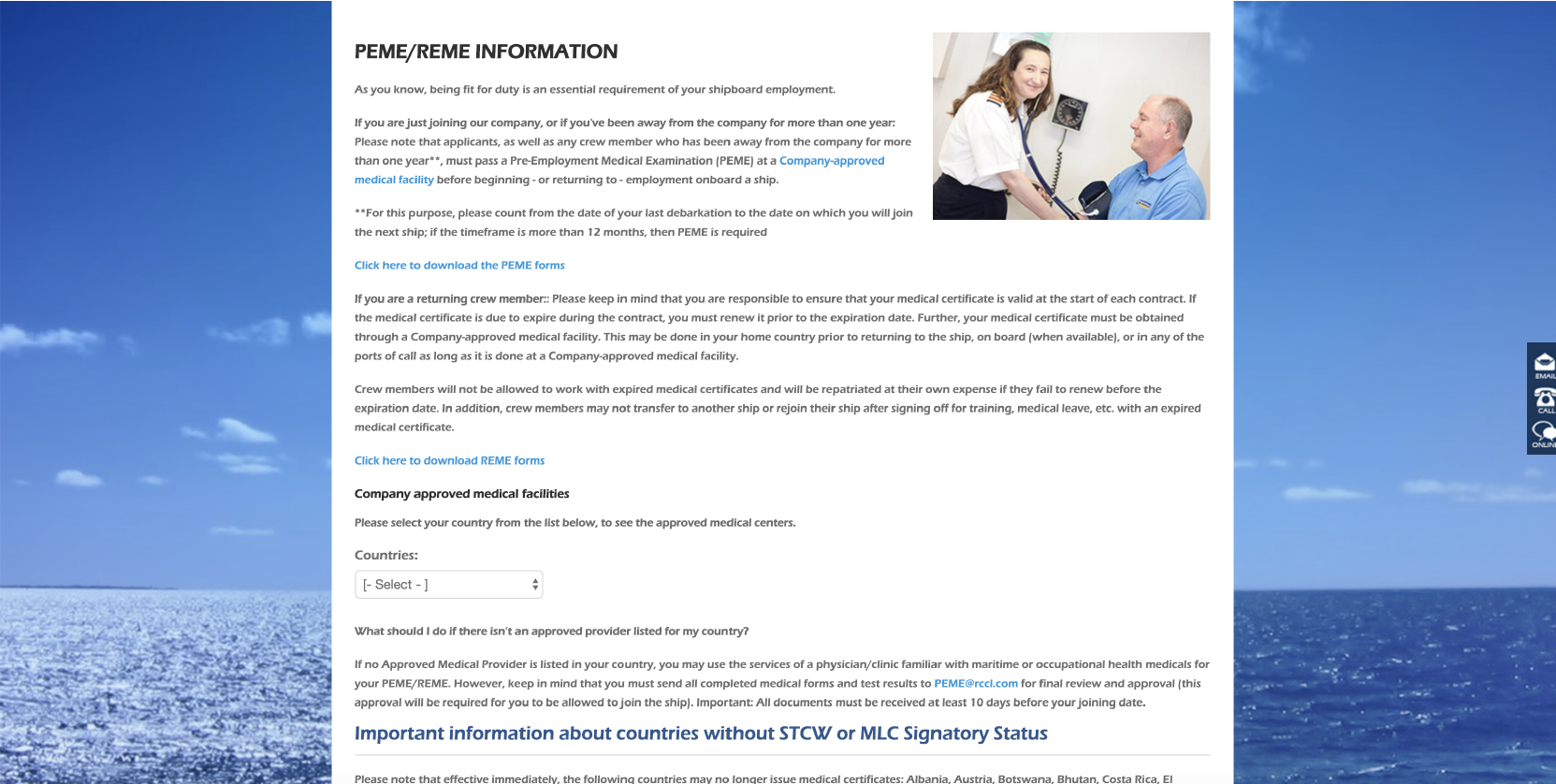
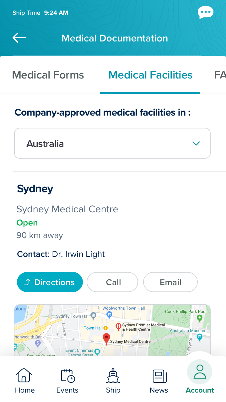
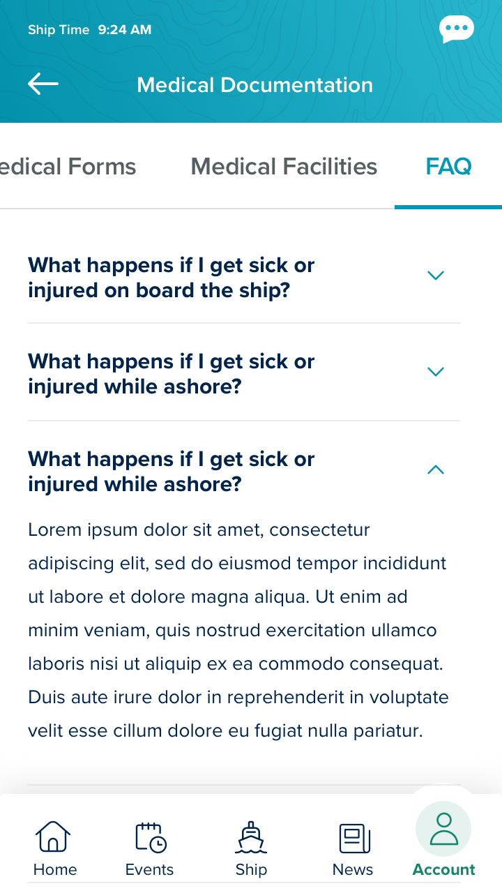
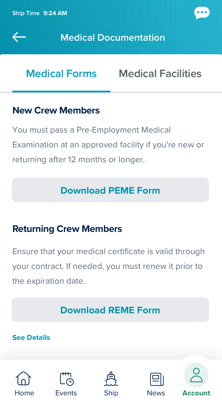
Medical Documentation
Port Guide
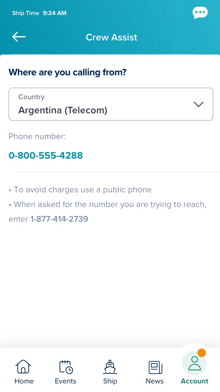
Crew Assit
This priorities are based on many variables, the number of resources we have as a team, and some IT dependencies, because some of the APIs were being re developed in order to be able to scale to the entire fleet.This has been an issue for a long time but now that the sites contain real time information and messages that are time sensitive it is more important than ever that the crew members can access this very easily and get everything they need without loosing connection with the servers or having to wait long periods of times without a response
App Analysis - Old Design
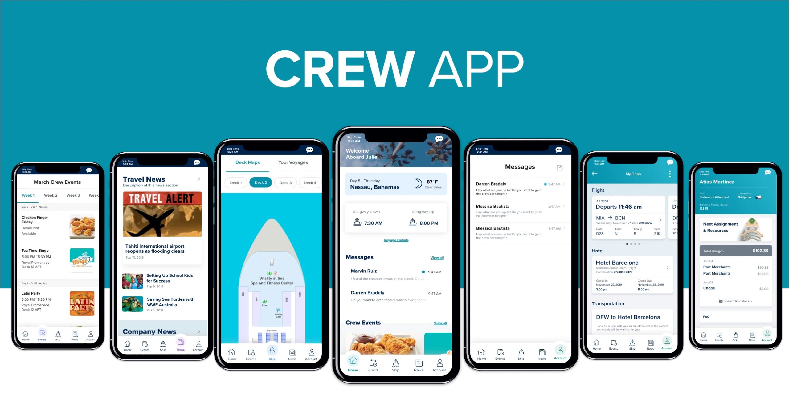
This was the beta version of the App was designed and built in Manila and it worked for 2 years but unfortunately the services are so slow and the login was crashing every day, making the life of the crew members harder. This app is vital because it has all the information about travel, contract and assignments.
One of the main issues of the current app is the navigation flow, users seemed to be confused of how to access some features because the way the main navigation is working and how the information is being distributed.
Market Research
I decided to split the market research analysis in small slides, meaning that I went and test apps and services already existing for each of the features we were going to develop, the intention behind this is that there is not a single app that we can reference that meets all of the requirements we are looking for, but there is many apps with a lot of different functionality that we can use to backup our user experience .
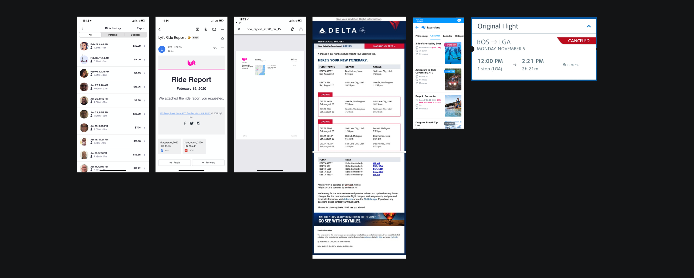
As I have mentioned before, the project consisted in making the pre-boarding experience easier and faster for the crew members. During our research we needed Visa Requirements with 2 uses cases, general information , and information related with the assignment, for this we decided to go with some rough UX provided by the US embassy about visa requirements. Travel Itinerary was our second biggest effort and we found Delta, American Airlines, Expedia and booking pretty useful because the way they are displaying information, we tried to abstract the information architecture from their sites and implementing some of that with our own requirements.
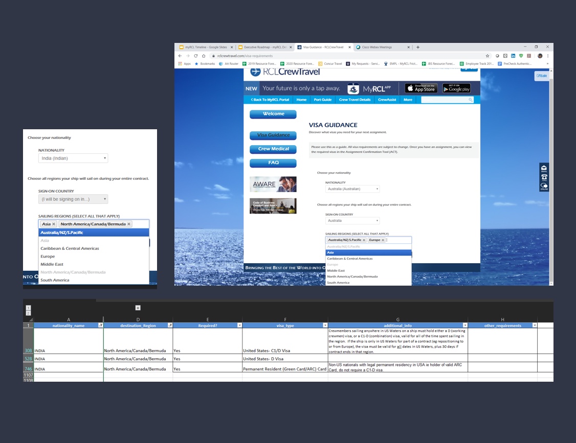
Visa Guidance - Feature
I am explaining this features in not particular order, but I think it will help to explain my design thinking process.
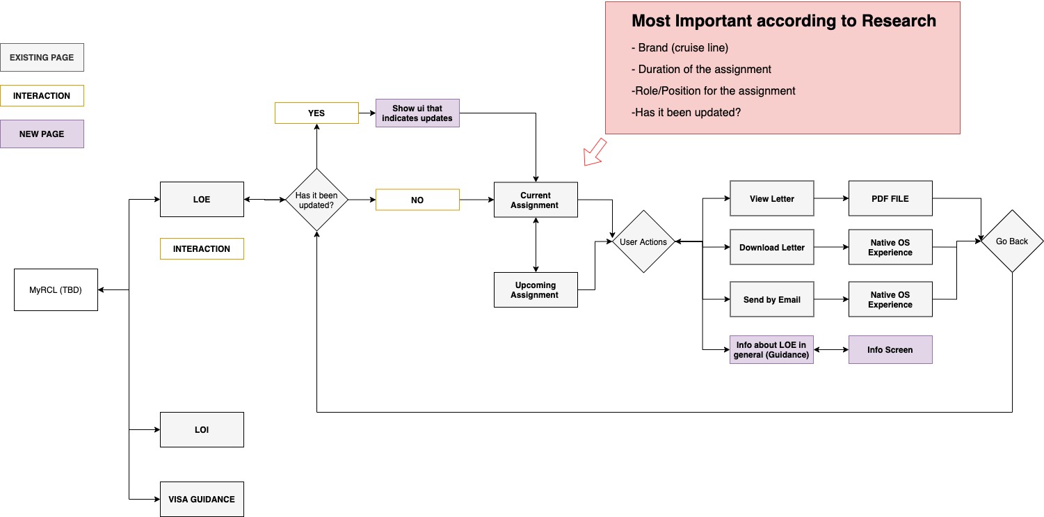
Visa Guidance
Show visa requirements based on your Nationality and Assignment
Visa Search Tool
Show visa based on your Nationality and Arrival Country
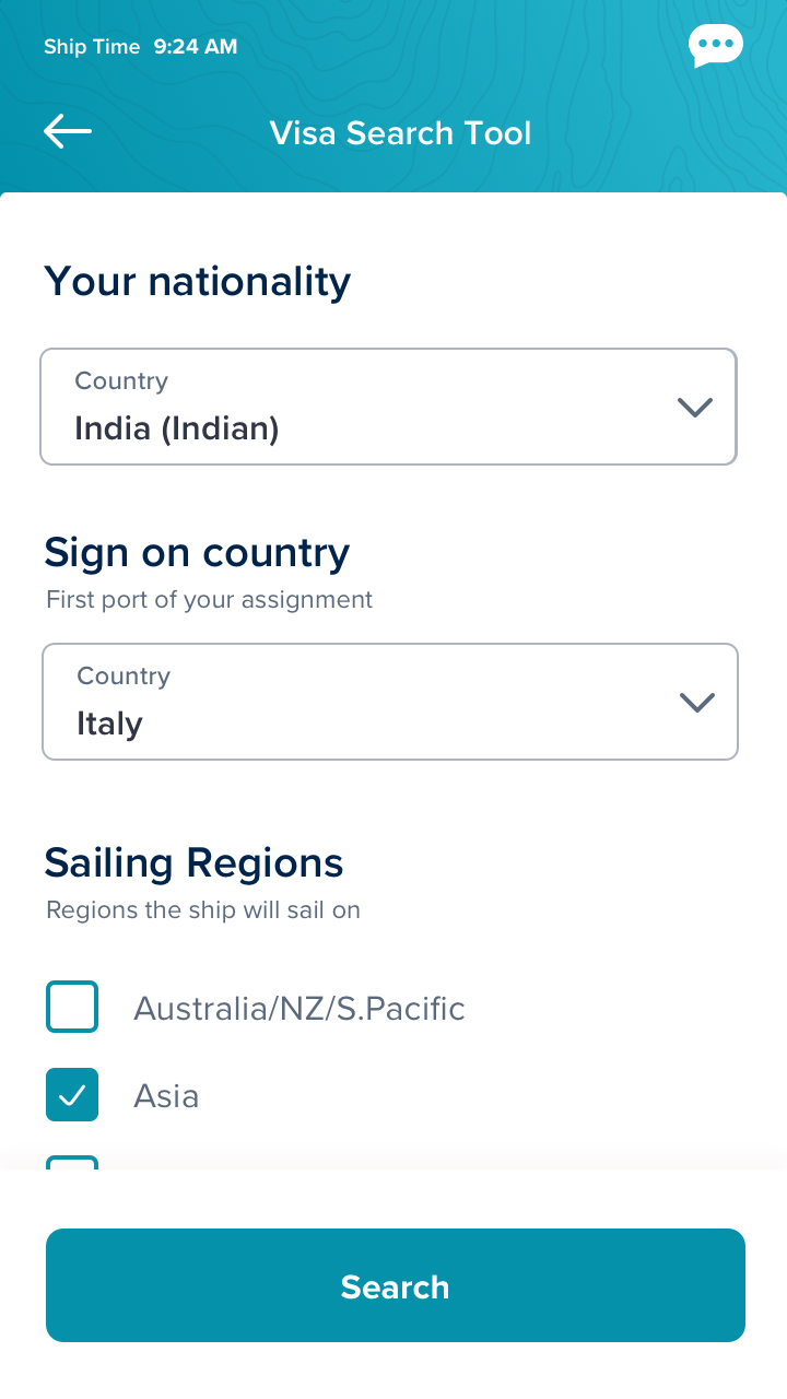
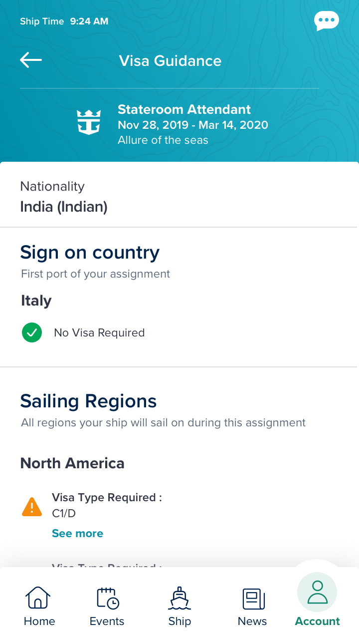
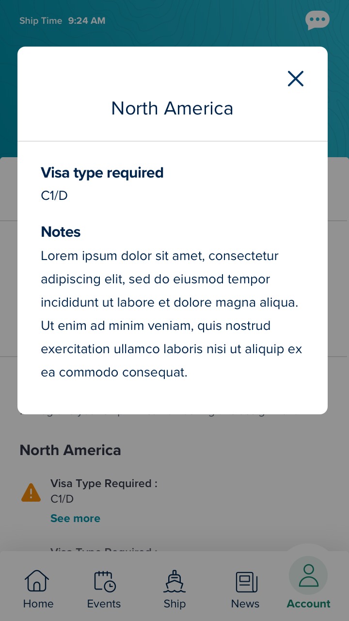
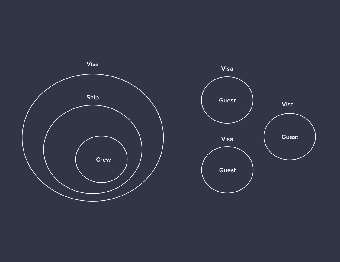
We had to do multiple meetings with different stakeholders in order to understand how the visa requirements work in the cruises when you are a crew member. One of the main differences with a "guest" is that as a crew member you are required to only have the visa of the country you are starting the assignment and there is a new concept called "Sailing Region" that is basically where is the ship going during the contract time, and each sailing region have different requirements depending on your nationality
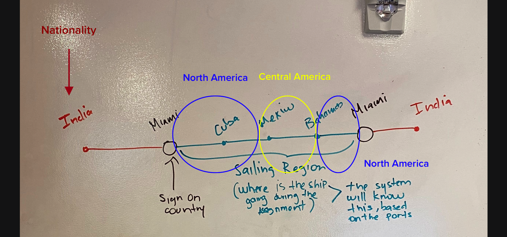
Is very common that the crew members go to multiple sailing regions during the same assignment, and each of this regions can have multiple visa types depending on your status and your nationality, in this stage of development we wanted to be as informational as we can, with the idea that in the future we will be able to provide accurate information of which visa exactly you will need based on your profile and in the information of previous contracts.
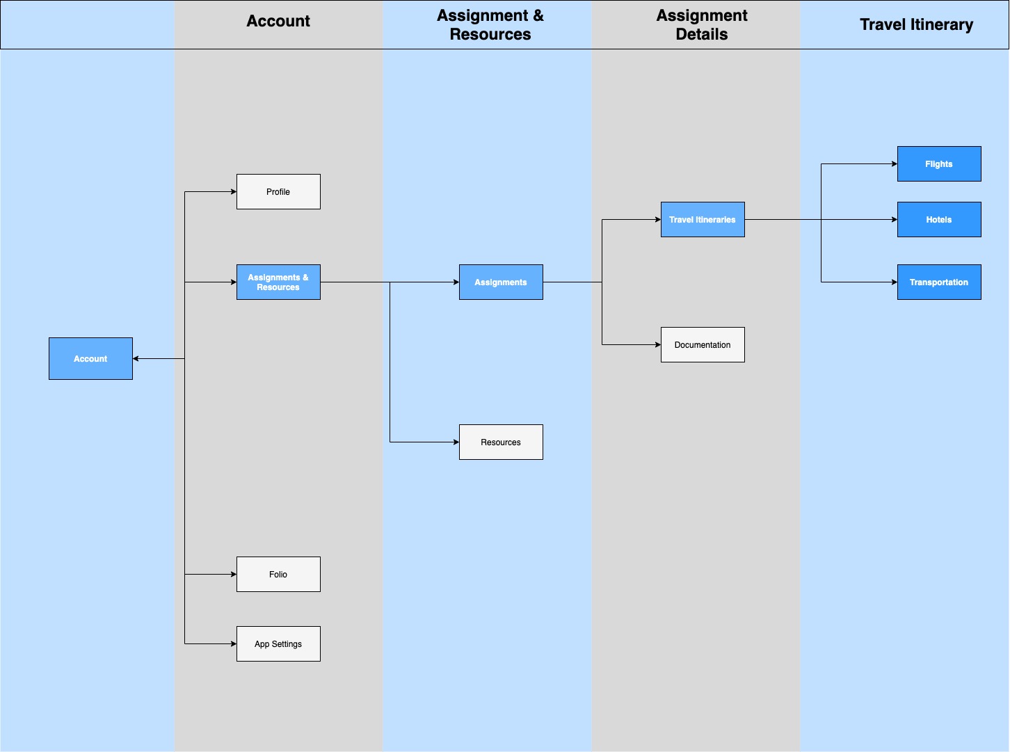
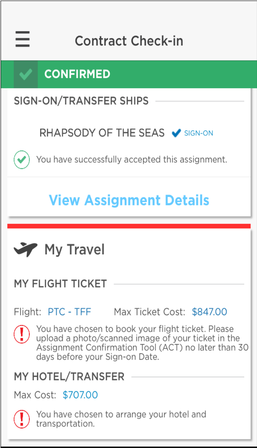
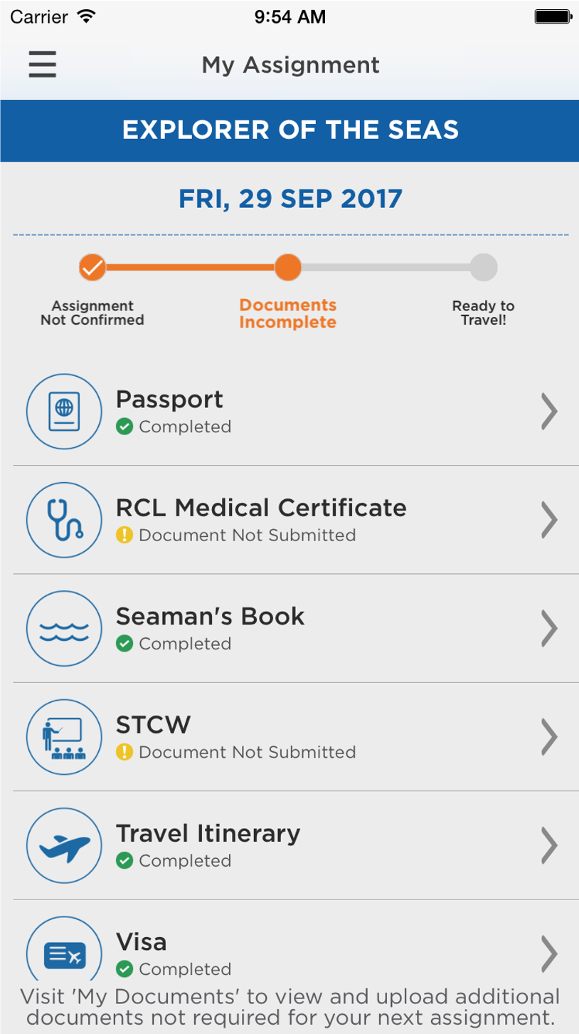
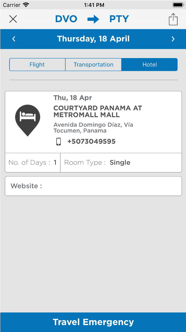
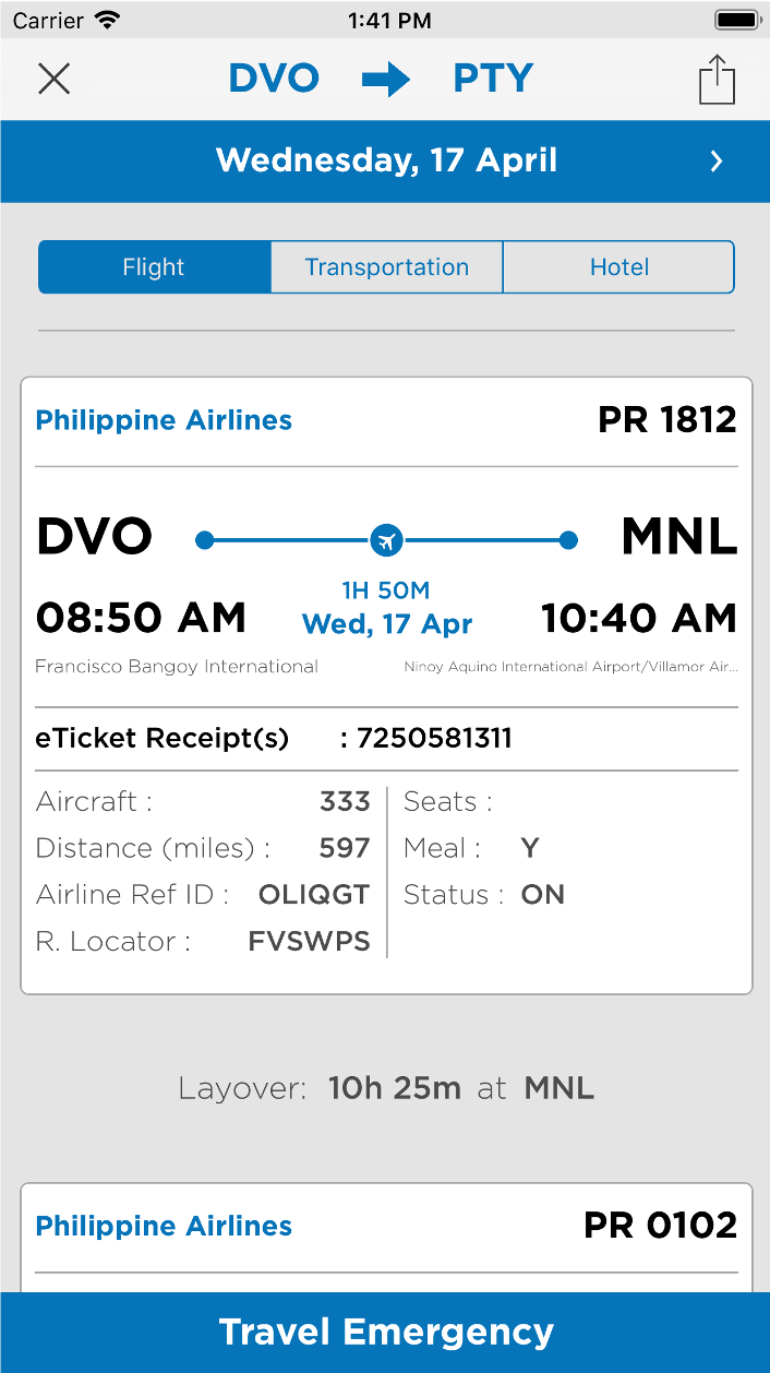
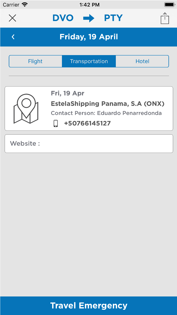
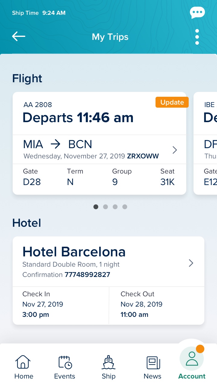
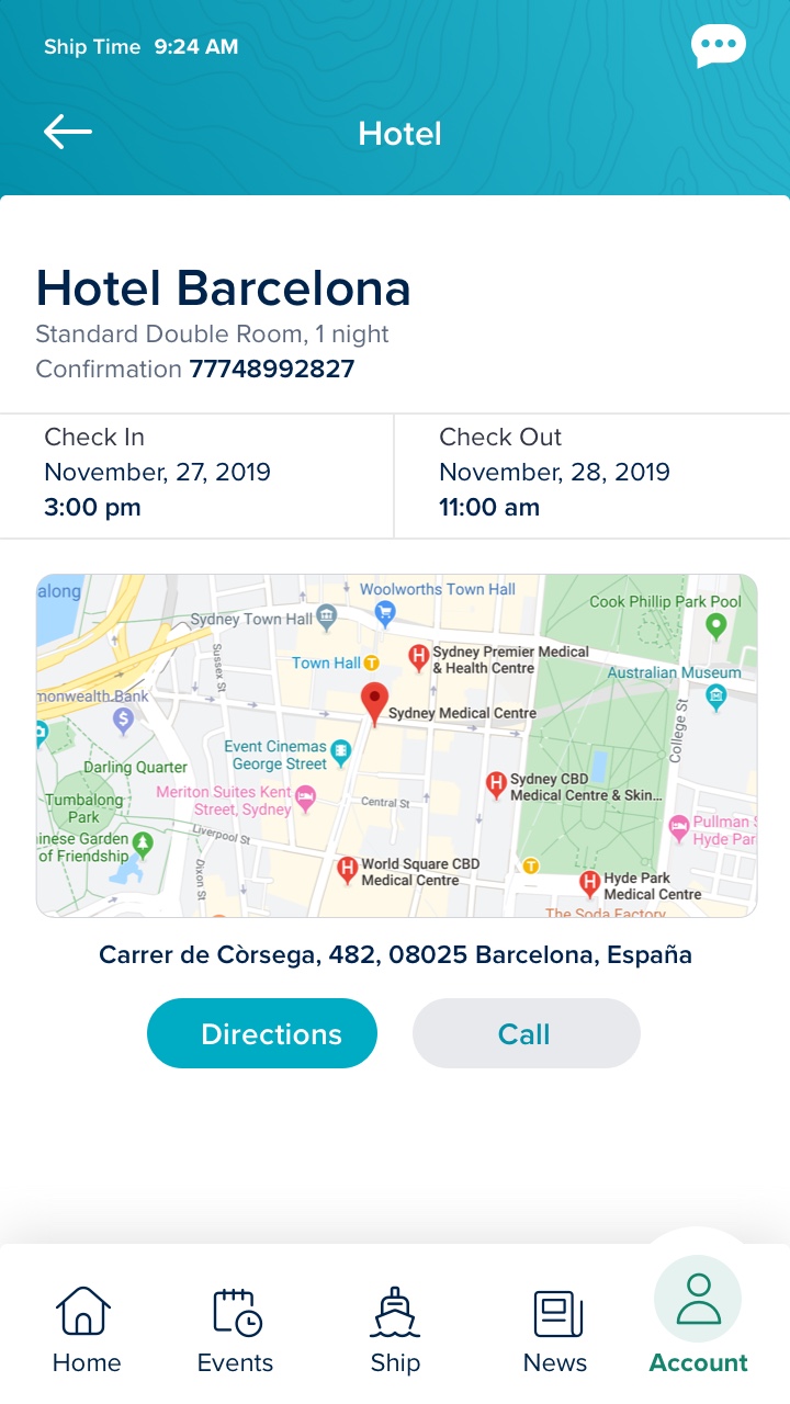
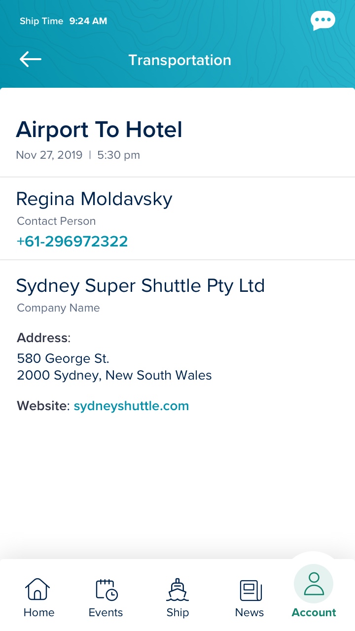
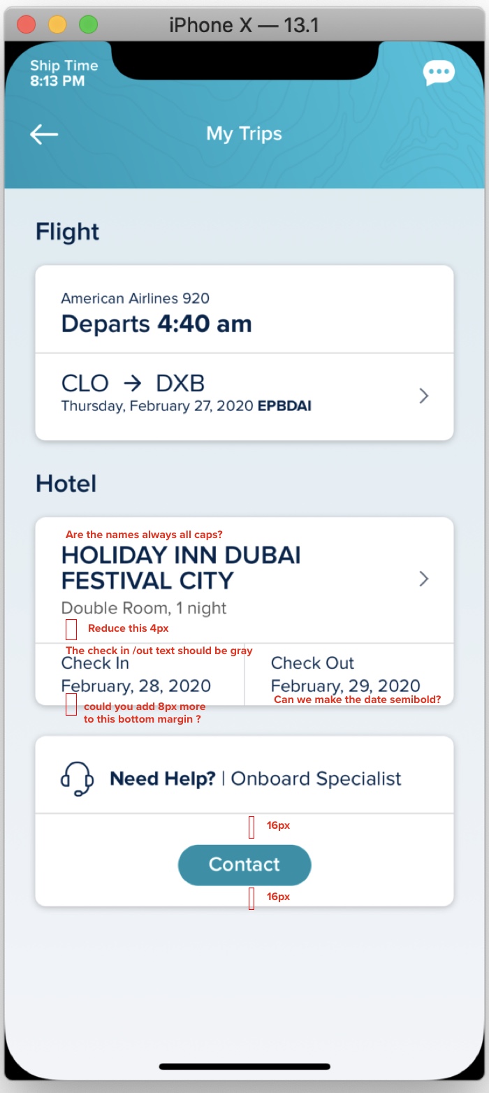
Travel Itinerary - Feature
This is one of the main services that the crew members can access thru the mobile app. It is very important to be clear about the information because the contracts depend on it. The travel itinerary is all the information of how the workers are going to get from their home country to the port of sailing country and back to their home at the end of the contract. This information contains flights, hotel, transportation and travel service in case they are lost anywhere in the world.
Flights
Real time information about the flights
Hotels
Reservations / Check in – out
Transportation
How to go from one place to another
Old Design
One of the main problems with the old designs is that were built for a single itinerary , it means that the user can only see one (the upcoming trip only) but this is a big limitation because sometimes the contracts are very close between them and the workers need to know how are they going to get to next port.


New Design
This designed is based on many patterns already existing in the market like Delta and American Airlines, we solved the multiple travel itineraries using a card carrousel very common in the multi-stop flights. For the hotel section we decided to use some UX already existing in Booking Mobile app , where they show the main information upfront and then you can go deeper to see details, and for the transportation our UI is very aligned with what Uber and Lyft display in their apps after a ride (summary). The last thing we added was a way to show UPDATES if something changes the user needs to know where to go, specially because this is real time information we need to keep our crew members informed of any changes in the itinerary.
More Features (Work in Progress)
All of these screens are diferent user flows, they are part of the same app and as you can see they merge the general Crew App because we are trying to create an unique experience .
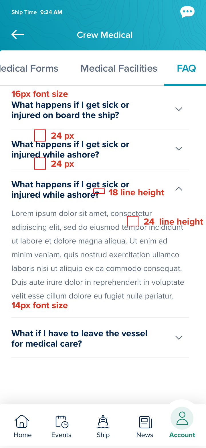
QA Design Process in Different Stages
We are trying to make sure the user has a consisten experience across the platforms and this requires very strict QA in different stages of the development process. We work very close with the Devs, the product team and with other designers to make sure we catch all the little details in each screen .
People ignore design that ignores people.